I wrote a post a few months ago based on some data from Correlation Ventures about the distribution of returns on venture deals (which revealed that outsized winners are, in fact, much more rare than most people think).
Today I’m focusing on companies in those top return categories with some new data from Correlation that show the percentage of large exits (>$500M) that are generated through M&A vs. IPO (quick side note: I seriously love how much information Correlation collects and how free they are in letting me post about it – as a reminder, Correlation is a firm that co-invests based on an algorithm that predicts the success of the a company; we’re in a few deals together and I can tell you the process is quick and painless; end of advertisement, but seriously – these data are from their work and the fact that they’re so interesting shows why the model works for them).
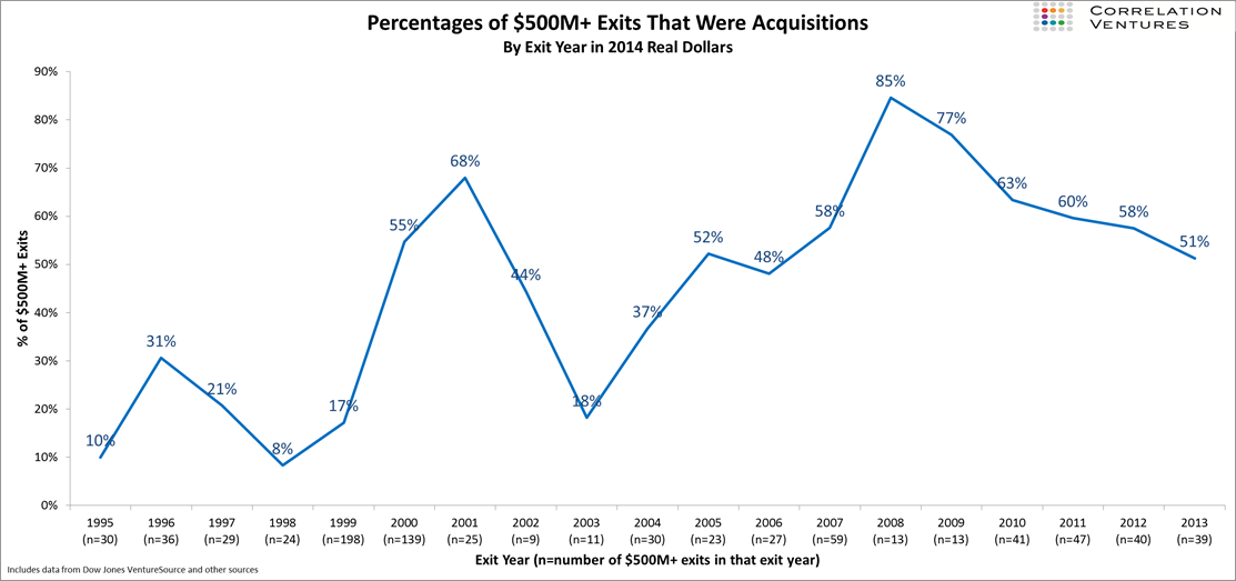
The graph below shows the trend of exits – IPO vs. M&A over the past handful of years (side note here that Foundry, like many firms, considers an IPO a financing event, not an exit in and of itself; although obviously it can be a path to an exit shortly thereafter).
A few key take-aways here:
– Acquisitions represent about half of all large exits in recent years, showing that both are – at the moment – reasonable paths to exit.
– There’s quite a bit of variability year to year (and cyclicality – not surprisingly), but the overall trend has been to more larger acquisitions (at least relative to IPOs). This reached it peak in 2008, although that may in large part be due to the lack of a public market option at that time.
– Generally speaking this trend holds true regardless of the absolute number of large exits in a given year (this is from the underlying data – not the graph, obviously).
I find data like these fascinating. Humans are horrible at proper attribution (a subject for another post) and I think this is particularly true in a hype driven industry such as venture/entrepreneurship. We all latch on to the big stories and the outlier returns – likely why so many people wrote me after my post on the distribution of venture exits and why there was so much interest on Twitter about it – the data didn’t match the heuristic people had in their heads. For me at least the same is true here – I would have expected the percentage of large exits from M&A to be significantly higher than exits through IPOs.
And that, of course, is why it’s important to actually look at the numbers rather than guess.
